Author: Maddie van Leenders
One stereotype of the historian is that he is intimidated by, maybe even frightened for, but also reluctant to use new digital possibilities to do and present their historical research. Frankly, I am among them. Although the historians of this generation get more in touch with these techniques, by courses during bachelor or master phases for instance, this approach is still completely different from the known tradition of writing, reading and interpreting of texts. This new digital age and its possibilities, however, cannot be ignored.
And maybe that is also why I got fascinated by John Theibault’s article, Visualizations and Historical Arguments (2013).Theibault, director of the South Jersey Center for Digital Humanities at Stockton College and proponent of digital visualizations, starts his article with the famous one-liner: ‘A picture is worth a thousand words’. In his argumentation however, he emphasizes visualizations in terms of digital statistical ones, such as animated maps or graphs. Theibault argues that these digital visualizations can be used for both doing research (e.g. easy recognition of patterns in immense datasets) and, in particular, for presenting research and bolstering the historical argument.
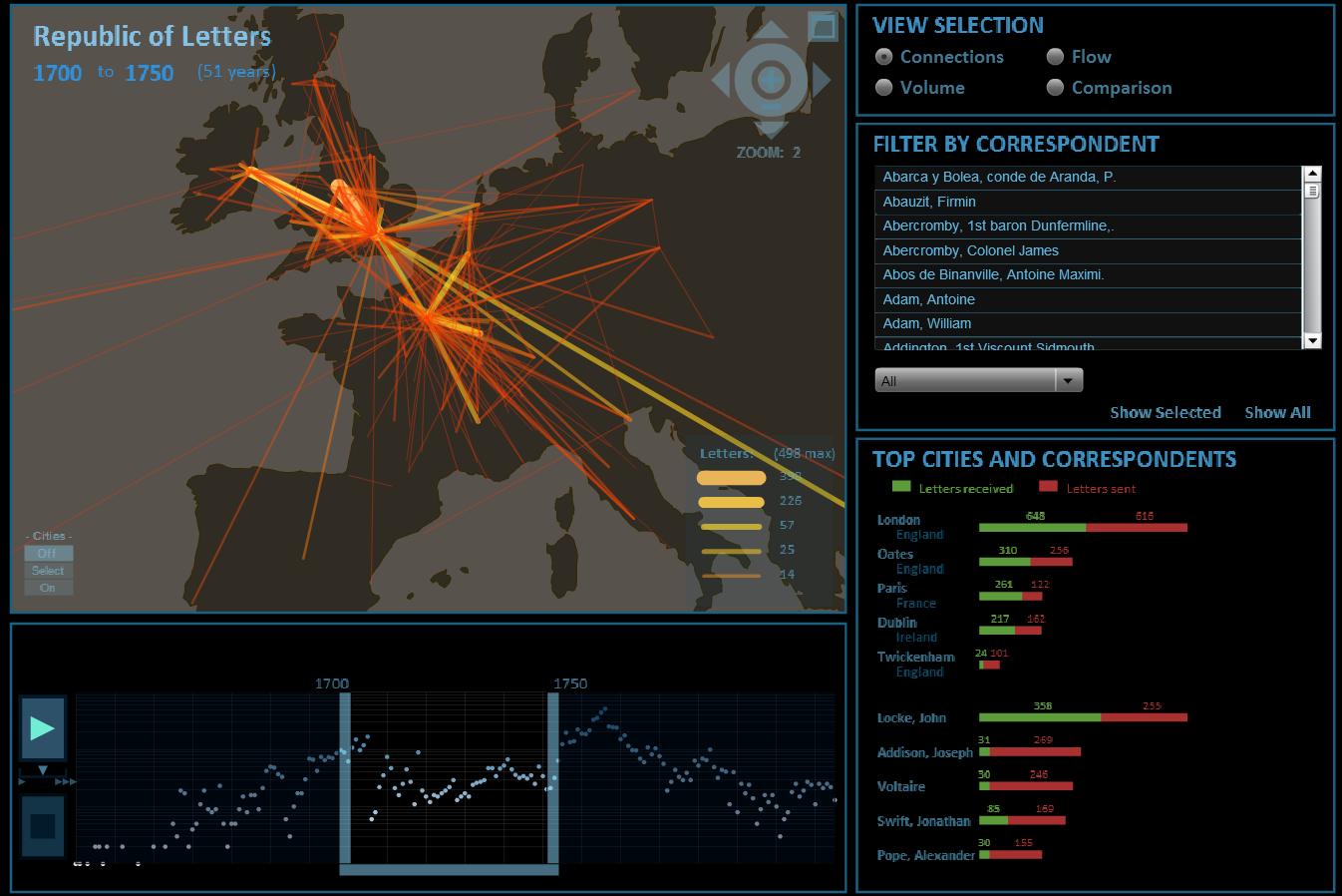
Theibault gives us multiple examples of visualizations, built by and for historians. One of the examples is the time-lapse map of nuclear explosions between 1945 and 1998 by Isao Hashimoto. Another one is the digital network visualization Mapping the Republic of Letters, developed at Stanford University. Although these projects are illustrative and inspirational, Theibault mentions the existence of a ‘gap’ between historians and these digital visualizations. According to Theibault, historians often have a ‘print mentality’ towards them: their knowledge is often falling behind in the digital, animated area. Besides that he argues that historians traditionally use statistical figures more as a ‘supplement’ rather than as the basis of the historical argument. At the end of the article, he concludes: ‘In either case, at some point, historians will have to accustom themselves to ‘reading’ network diagrams as adeptly as they read maps or scatter plots’.
His main argument seems to be that these digital visualizations are the future and that we expect from today’s historians to learn how to use complex, digital ones for doing and presenting their research. This made me wonder: to what extent do historians have to accumulate knowledge about these complex digital visualizations, before they are labelled as ‘old fashioned’? And to what extent is this new way of doing and presenting research going to replace our traditional historical method? Of course, I was not the only one with these questions.
On January 5th 2015, the American Historical Association held their annual meeting, dedicated to the subject ‘Text Analysis, Visualizations, and Historical Interpretation’. The meeting’s abstract does not only acknowledge the enrichment of these digital visualizations, but also poses some critical questions about the consequences for the historical profession. For instance, how do they answer questions about causality, correlation and historical interpretation, which are typical for the historical method?
Likewise, historian Greg Burris pays attention to this in his review of David Staley’ book Computer, Visualizations, and History (2013). According to Burris, historical research has its origin in text – history even starts with the invention of writing, he proclaims. Although these digital methods are unavoidable and may be the future, he insists that they will never take the place of traditional ones. We have to fit in these new digital visualizations somehow – and according to Adam Crymble, PhD History & Digital Humanities, we will need to cooperate with designers for this, as historians are unlikely to have an understanding of colour or form or how a website or a visualization is read or works.
In short, no one seems to deny the enrichment of the use of digital visualizations, and neither do I. However, these new digital methods bring along their own challenges and adjustments we as historians have to make. Maybe there should be more elaborate and deepening courses (already during the bachelor phase) to prepare the future historians for the new, complex digital visualizations and make them less intimidating. Nevertheless, I also agree that historians have to stay true to their original, text-based historical method. Interdisciplinary cooperation with statisticians and designers could be a solution, because I think it is quite unrealistic, and scornful perhaps towards other disciplines, to expect that historians can also become statisticians and designers. So, perhaps we should ‘upgrade’ the historian, make him a little less ‘illiterate’ with digital visualizations, and ‘downgrade’ the expectation that the historian also has to become a statistician and digital designer.
Sources