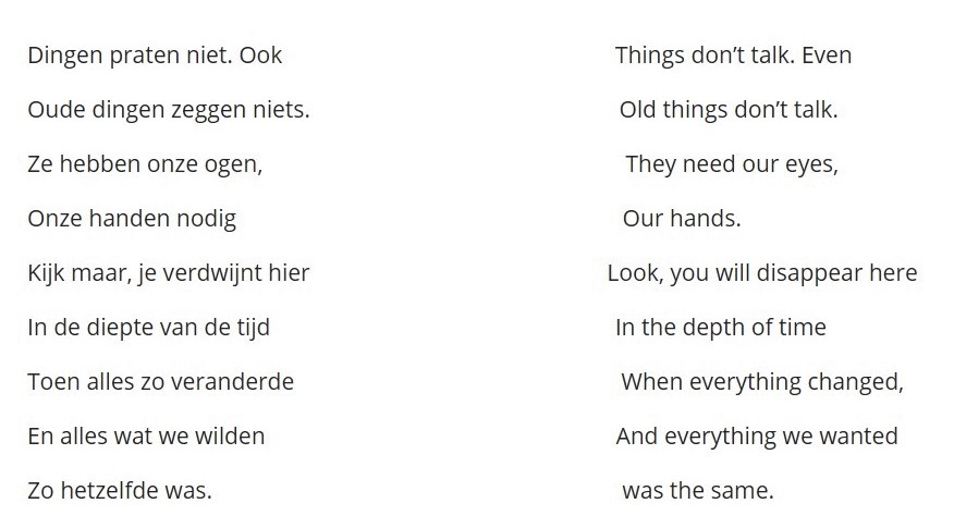
Leidsche Rijn, by archaeologist and poet Esther Jansma (English version is my own translation)
This poem by Esther Jansma is on one of the walls in the exhibition “3000 jaar wonen en werken in Leidsche Rijn” (3000 years of living and working in Leidsche Rijn). I think a lot of people would agree with her sentiment that things cannot talk, at least not literally. Making objects talk, is an art that museums are trying to master in various ways. Lately, a lot of museums use digital tools to try to convey information to the visitor. Sometimes these digital tools complement objects, other times they replace them entirely.
When the exhibition in Leidsche Rijn opened in 2016, the NRC (one of the Dutch national newspapers) gave a 5 star, raving review about the way the museum made use of digital tools and the way it displayed objects in a more “traditional” way as well. It made me curious, and I went to have a look myself.
A modern interpretation
Castellum Hoge Woerd was initiated by the municipality of Utrecht (Gemeente Utrecht), especially the department of Heritage (afdeling Erfgoed). The building was opened in 2015, and houses not only the remains of an old Roman ship, but also a theatre, restaurant, farm, educational zones and since 2016 also the permanent exhibition “3000 jaar wonen en werken in Leidsche Rijn”. The building was inspired by a roman fortress that once stood in the exact same spot. It was designed by architectural company SKETS, and it is a reinterpretation of that Roman fortress.
Leidsche Rijn is a former horticultural zone, west of the city of Utrecht. In the nineties, a huge housing project started, with the aim to build homes for about 100.000 people. During the constructions, a lot of archaeological research was carried out as well and over a 100.000 historical objects were found. These objects date back to 3000 years ago. The history of the Leidsche Rijn area is explained in Castellum Hoge Woerd, and some of the most recent digital innovations are used to compliment the objects. The aim is to attract a varied public, young and old, local to international. A lot of families live in the area around the Castellum, so I was curious in what way the exhibition was designed for children. The roman objects can also be placed in an international context, that of the Roman border the limes. This is an opportunity for the museum to attract foreign visitors as well.
So I went to explore the museum, and asked myself the questions: does the museum succeed in doing that? In what ways does the museum use digital tools to supplement the objects? In short, in what way does the museum give the objects their voice back?
Time machine in a fish trap
I went on a Tuesday morning, and the museum was absolutely deserted. But that gave me the chance to walk around and explore at my own leisure. To be straight upfront, I think the museum has done a wonderful job using digital tools in the exhibition, without distracting people from actually looking at the selection of the objects that are displayed. When I was walking out of the exhibition, I really had the feeling that I had learned a lot about the history of the area in a really exciting way. I will pick out some of the highlights that made the visit special.

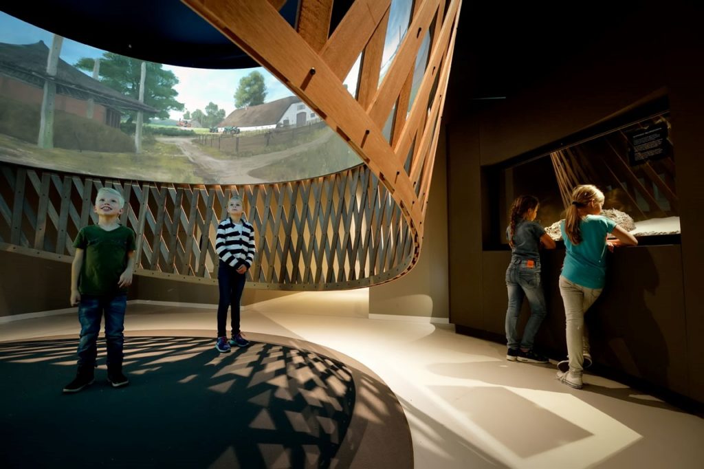
The eyecatcher of the exhibition is definitely the “fish trap”. It is a 360 degrees screen, for which you have to stoop a little to get in. Once you stand in the middle, you can see three thousand years of history all around you. Illustrator Joeri Lefévre and animation studio PlusOne created together with archaeologists an accurate and enchanting panorama, from one point of view. On the bottom of the screen, you can see the year, that starts in 1300 B.C and eventually ends in 2007. You can see how the people, nature and animals changed over time. It starts with a ritual killing of a deer, Romans are walking by, there is a flood, the attack on castle Nijevelt, the crashing of a German airplane during the Second World War, and in the end how the archaeologist find the remains of the same deer that was killed in 1300 BC, in. And then it starts all over again. I found myself standing there for several loops, taking it all in and being really impressed. Everything you see is based on archaeological finds and scientific evidence. You are immersed in the past, and this feature of the exhibition makes it worth coming all by itself.
Another feature makes visiting the museum especially appealing to locals. There is a screen on which a map is displayed, and you can swipe through it and see what archaeological objects were found in your neighborhood, and even street. You can see what the landscape looked like in the time of the find, and there is a modern map as well. I think this feature can really inspire local visitors, who live in an area where twenty years ago only grass was growing, and now shows them that they actually live in an area that has a lot of history, even though it isn’t visible above ground nowadays.
The museum is made very suitable for kids. All the digital features are on a perfect height for them, and at the beginning of the exhibition there is an area where they can learn what an archaeologist does in an interactive way, with digital tools as well of course. There is, however, a sign when you walk in that says that all children under sixteen years old should be accompanied by an adult. The museum also realizes that children/youngsters and digital tools are not always a good combination.
The museum also uses “eyewitnesses” to tell the story behind objects. There are always signs next to the object, but sometimes a video of a historical character is used to give a more personal take on the story behind the object. There is a so called Pepper’s ghost (a kind of hologram) of a farmer’s boy from the Leidsche Rijn area, who has signed up for the Roman army. He tells how it is to be a farm boy, and what adventures he has while serving in the army. The guy in the Pepper’s ghost holds several objects, and those same objects are displayed in real life around the screen. In between the tales of the boy, the history on a larger scale is explained, about how common it was for conquered people to sign up for the army to gain Roman citizenship. Because of the amount of information that is given, and the personal touch to a much broader story, this hologram adds to connecting a maybe abstract history to a face, and in that way making it easier to remember.
Reverence of objects

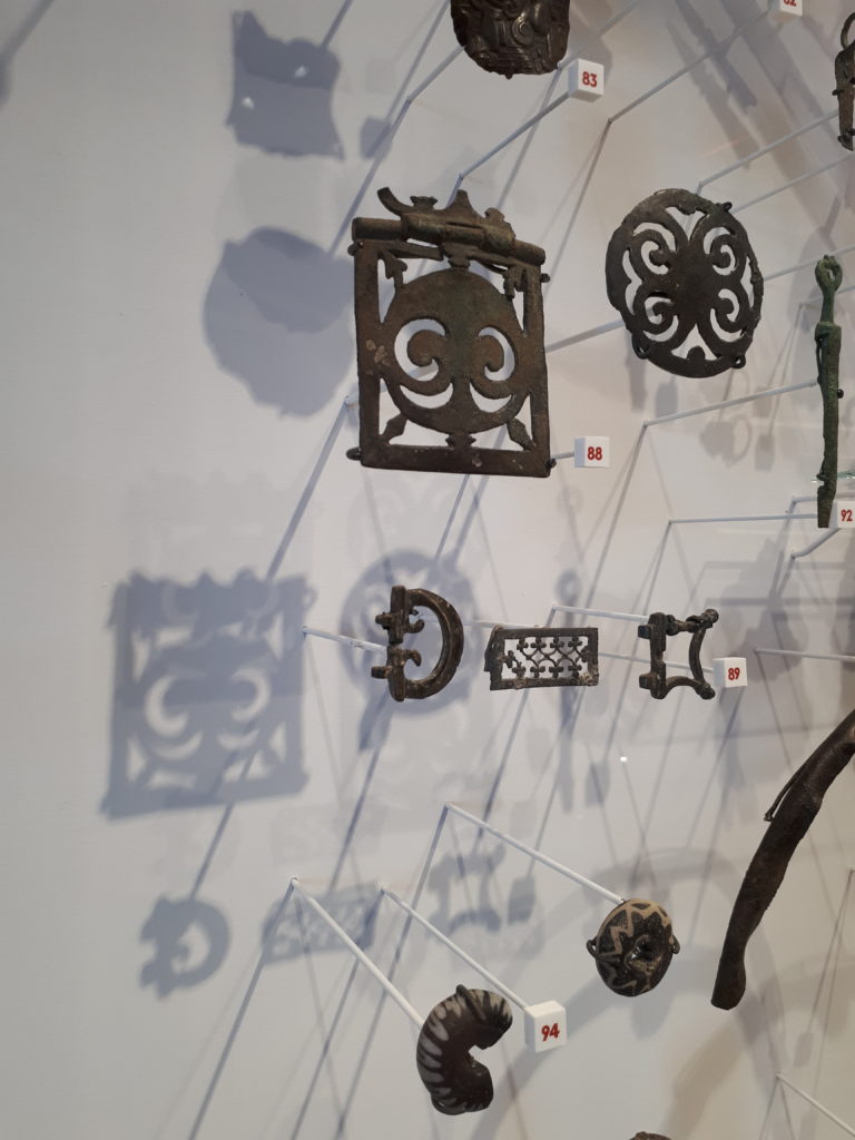
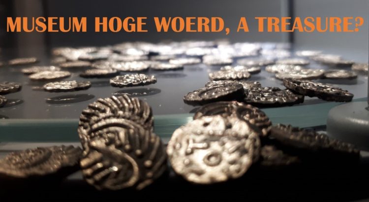
There are many more examples of digital tools being used, and a lot of them in a very successful way (iPads disguised as a Roman wax tablet for writing, digital plates that show what food was eaten in what era and how they made it, a screen with a medieval woman explaining what whatever object you choose, etc.). The design, done by Pronkstudio, makes the digital tools look tasteful, and easily guides you through the exhibition. One thing that I find really impressive, is that even though there are so many digital tools to get distracted by, the real-life objects feel just as important and are presented in an eye-catching way as well. Some objects are even displayed in almost reverently. One entire side of the exhibition consists of a wall of objects, sorted per theme. The objects are mounted on the wall on little sticks in a way that they seem to float towards you. You can see the care that was taken to place each object, no matter how tiny, to their best advantage. Next to them is all the information you would expect to find in a more traditional museum.
So is there nothing to criticize? There are a couple of things I want point out on that matter. Firstly, the sounds of the 360 degrees panorama and the hologram carry a bit far, but since it was just me walking around, the quiet was more noticeable than if a school class had been there for example. And second, the exhibition has an English and German audio guide, but all the digital media are in Dutch only. The website is only in Dutch as well, so an international visitor is not able to experience some aspects of the exhibition as well as a Dutch-speaking person would.
To conclude, I think the museum in Castellum Hoge Woerd is a really good example how digital tools can complement objects and make a museum visit more memorable, without losing sight of the importance of the physical objects. To refer back to the start of this blog: things can’t talk. They need our eyes, they need our hands. And sometimes a little bit of digital tools won’t hurt either.
Hester Wynia
For more information:
https://www.castellumhogewoerd.nl/
https://www.museumhogewoerd.nl/
